More from daniel yanez


Image by Nano Studio Pro · daniel yanez — free under CC BY 4.0
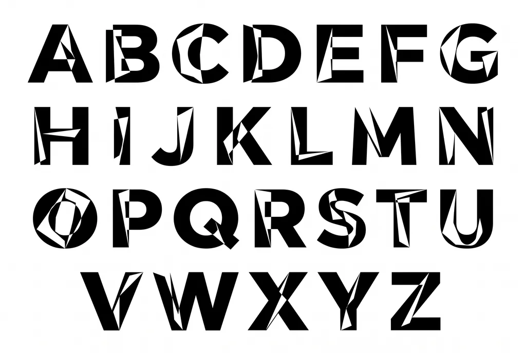
A high-contrast, minimalist digital graphic showcasing a complete uppercase alphabet, rendered in a bold, sans-serif font style. Each character exhibits a unique, deconstructed aesthetic, featuring sharp, angular geometric cutouts that create a sense of fracture and layered depth. The typeface is presented in stark black against a clean white background, emphasizing the negative space created by the internal splintering of the letterforms. The characters are arranged in a structured grid across four rows, with letters A through G in the first, H through N in the second, O through U in the third, and V through Z in the final row. This design feels distinctly modern, industrial, and experimental, likely intended for bold branding, editorial headlines, or avant-garde poster art. The consistent weight and size of the letters maintain a strong visual rhythm across the composition, making it a sophisticated study in typographic manipulation.
More from daniel yanez


