More from daniel yanez



Image by Nano Studio Pro · daniel yanez — free under CC BY 4.0
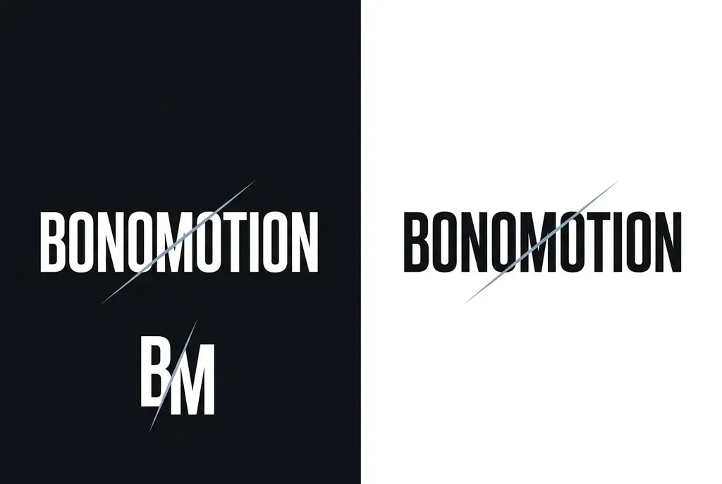
This graphic design composition presents a split-screen layout featuring a high-contrast black-and-white color scheme. On the left side, the text 'BONOMOTION' is rendered in a clean, bold white sans-serif typeface against a deep black background. Below this, the abbreviation 'BM' appears, intersected by a stylized thin diagonal line which repeats in orientation across the composition. On the right panel, which features a white background, the 'BONOMOTION' text is shown in black, again crossed by a similar diagonal line that cuts through the characters. The design language is minimalist, modern, and corporate, emphasizing geometric precision and strong visual weight. The use of light-colored, slate-blue lines provides a subtle accent to the stark monochromatic base, creating a sense of dynamic movement within the otherwise static typography.
More from daniel yanez