More from daniel yanez


![[Image 1] lay out a cop clothing and accesories…](/gallery/img/gal_8033c96d-0c72-42c3-bdd8-bc22796c71fa?w=220)


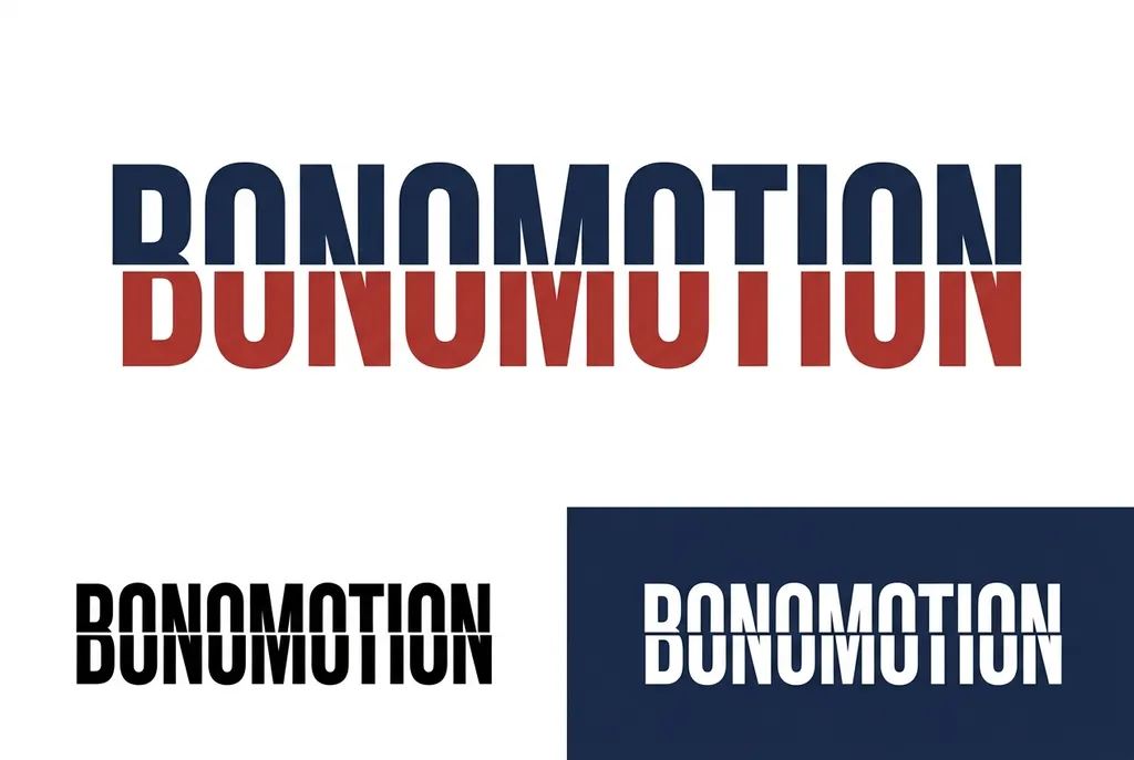
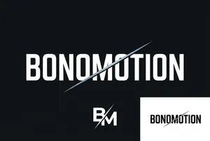
BONOMOTION typography and logo variations
Image by Nano Studio Pro · daniel yanez — free under CC BY 4.0
This graphic design presentation displays a bold, split-typography logo titled BONOMOTION. The primary visual element is a large, two-toned wordmark where the top half is rendered in a deep navy blue and the bottom half in a rich, rustic red. The letters exhibit a clean, sans-serif, high-contrast font choice with a vertical split that suggests motion or reflective qualities. Below this primary version, the design demonstrates the versatility of the branding with two smaller variations. On the left, the same text appears as a solid black emblem on a white background, highlighting the strength of the letterforms. On the right, a negative space version features white lettering against a dark blue background, providing a high-contrast alternative. The overall aesthetic is professional, minimalist, and modern, suitable for a corporate brand identity or motion design studio logo, utilizing a classic color palette of red, navy, white, and black to achieve clear visual impact.
More from daniel yanez



![[Image 1] lay out a cop clothing and accesories…](/gallery/img/gal_8033c96d-0c72-42c3-bdd8-bc22796c71fa?w=200)