Image by Nano Studio Pro · daniel yanez — free under CC BY 4.0
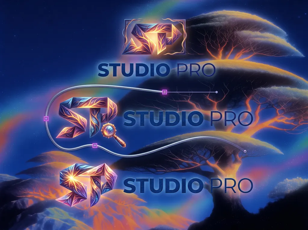
This is a polished digital concept design for a branding project titled 'Studio Pro'. The composition features three distinct iterations of the 'SP' monogram, each rendered with a crystalline, multifaceted texture that blends fiery oranges, purples, and deep blues. Behind the typography, a dreamlike landscape unfolds with glowing, alien-like trees that cast warm, ethereal light against a twilight blue sky. The central 'SP' logo is accompanied by a stylized magnifying glass, suggesting a focus on precision or exploration. A slender, elegant silver curved line winds through the middle of the graphic, visually connecting the elements. The typography used for 'STUDIO PRO' is a clean, modern sans-serif in a deep, sophisticated blue that anchors the bright, energetic colors of the logo marks. The overall aesthetic is highly polished and tech-forward, blending organic, fantastical nature themes with crisp graphic design elements suitable for a creative studio brand identity.