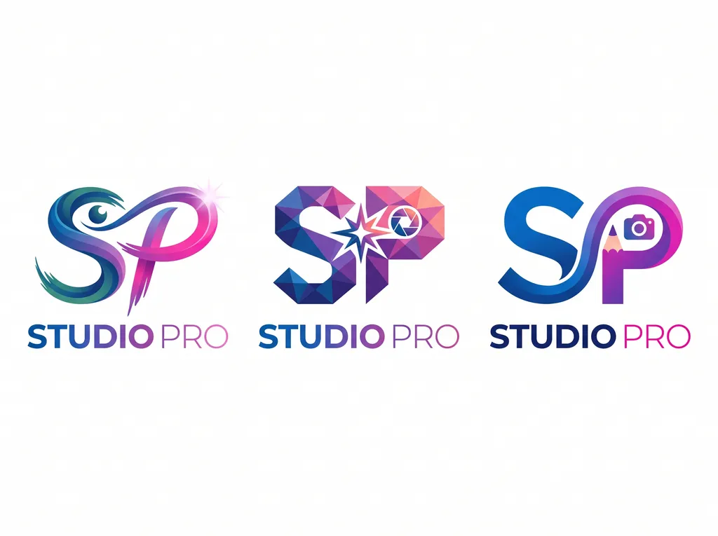
Three variations of Studio Pro logos
Image by Nano Studio Pro · daniel yanez — free under CC BY 4.0
This image showcases three distinct logo variations for a brand titled 'STUDIO PRO'. The logos are arranged horizontally against a clean white background. Each logo uses the initials 'SP' as the foundation but employs different artistic styles. The first logo on the left uses a fluid, brush-stroke-like aesthetic combined with an eye icon, rendered in gradients of teal and magenta. The middle logo features a low-poly, geometric 'SP' construction incorporating a starburst and a camera aperture icon, using a darker purple-to-pink gradient. The rightmost logo utilizes a sleeker, modern design that integrates a stylized pencil shaft and a camera lens icon into the structure of the 'P', utilizing vibrant blue-to-pink gradient tones. Each variation includes the 'STUDIO PRO' wordmark underneath, mirroring the color scheme of the respective graphic above it, maintaining brand consistency across diverse visual interpretations.