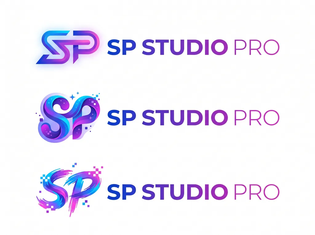
Three creative SP Studio Pro logo concepts
Image by Nano Studio Pro · daniel yanez — free under CC BY 4.0
This graphic design presentation showcases three distinct logo concepts for 'SP STUDIO PRO'. Each concept features a stylized 'SP' monogram followed by the brand text. The top row utilizes a clean, geometric, neon-gradient approach with a soft outer glow. The middle row displays a fluid, 3D-rendered, glossy ribbon style adorned with subtle sparkles and pixelated accents. The bottom row adopts a dynamic, energetic brushstroke style paired with digital 'glitch' pixel elements. All three logos share a consistent blue-to-magenta gradient color scheme, maintaining brand identity while offering variety in aesthetic execution—ranging from sleek and modern to ornate and artistic. The overall composition is clean, centered, and set against a stark, solid white background, emphasizing the versatility and creative potential of the brand mark across different visual languages.