More from daniel yanez





Image by Nano Studio Pro · daniel yanez — free under CC BY 4.0
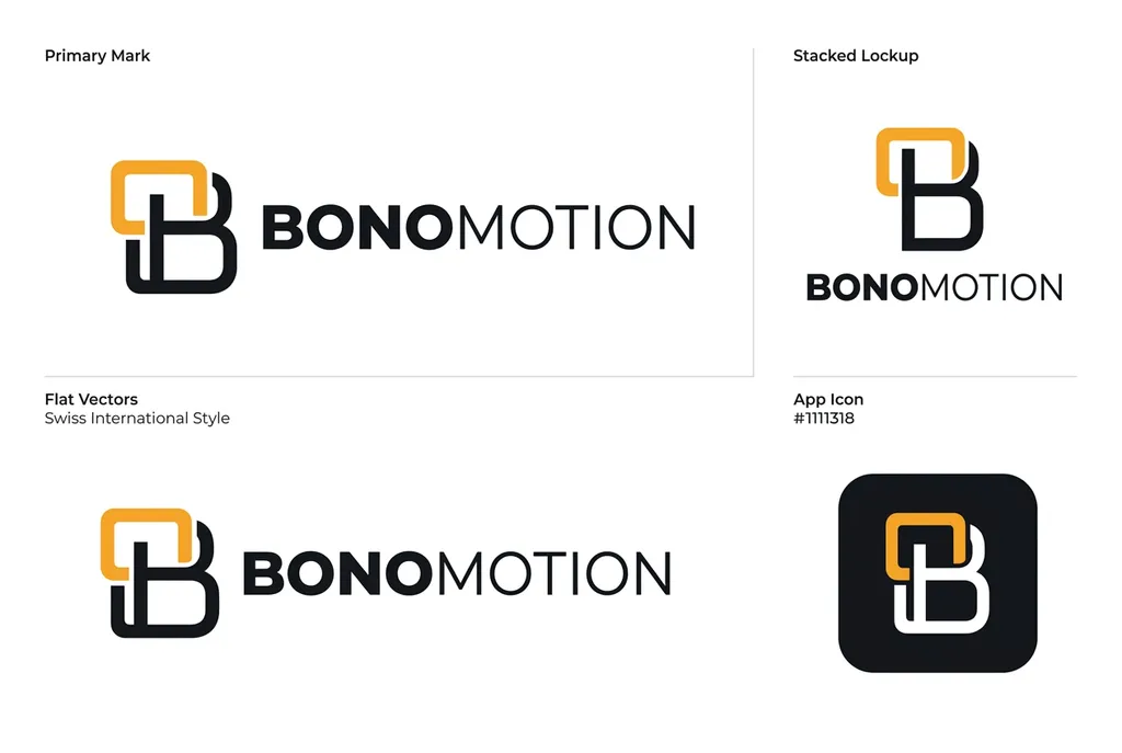
A clean, professional brand identity guidelines presentation for the company 'Bonomotion'. The layout is organized into four distinct sections on a white background: a Primary Mark, a Stacked Lockup, Flat Vectors, and an App Icon. Each logo design features a clever monogram combining an orange rectangular outline and a bold black 'B' character, followed by the brand name 'BONOMOTION' in a modern, sans-serif, high-contrast typeface. The aesthetic follows the 'Swiss International Style', emphasizing clarity, minimalism, and structural precision. The typography is clean and black, contrasting perfectly with the iconic orange element of the logo. The bottom-right section displays the App Icon, which integrates the monogram into a rounded-square container with a dark background. The entire document serves as a standard design specification sheet, illustrating logo usage, lockup variations, and technical style guidelines for corporate branding.
More from daniel yanez


